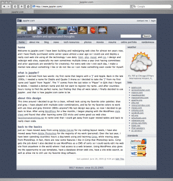
Go-Live Date: Mar 04, 2005 (Approximate)
Project Overview
Jappler.com is the custom web site of our lead developer - Jennifer Zelazny.

Front End Description
What you see here is about the 6th design I produced in a matter of six months. I spend many hours looking at some of the best designed web sites on the web and taking note of each part I liked and did not like. Since blogging has become so popular, web sites have starting mimicking the general blog layout. Experienced (my target audience) web surfers’ eyes are trained to look for navigation at the top of the page, the body of the page takes up the majority of the page, while I have section specific links on the right hand side. I moved to a two column layout so the pages were a little less busy and so you could focus more on the content.
Back End Description
There is no custom back end.
Lessons Learned/Random Thoughts
Even though I really like working with greys, I love working with blues and greys. The blue color of the design really warmed up the site as opposed to just working with greys. I also learned the value of using content management systems: templates, user privileges, cool plugins, etc. I chose to use my own hacked together version of WordPress, because I am very familiar with WordPress and I wanted a lot of customizations, and WordPress was very flexible.