Go-Live Date: Jan 02, 2008 (Approximate)
Project Overview
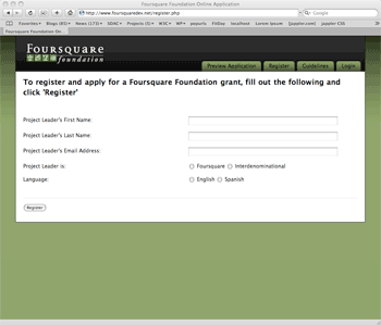
Foursquare Foundation offers their grants via an online application form (over 30 pages of questions in multiple languages).

Front End Description
The client wanted a user interface that was easy to use and light weight since the users were mostly from foreign countries where internet connections were often hours away. I used minimal images, CSS, and javascript to ensure the application process (30 pages of text, radio button, and select fields, and long essays) would go as smoothly and quickly as possible why still providing feedback to the user if they missed a field or provided inappropriate data. The admin also had to be easy to use, as the Foursquare staff needed to easily access the data after the applications were submitted or if the submitter had any questions.
Back End Description
This form needed to be presented in English and Spanish so all text (labels, error messages, confirmation email, etc) was stored in both languages and then presented appropriately with custom logic. We used HTML_QuickForm and Smarty to build the form quickly and effectively and then used jQuery to handle custom validation rules given to us by the Foundation.
Lessons Learned/Random Thoughts
This was by far the longest and most complex form I have ever worked on or seen. Adding in multiple languages this form was also very time consuming but a great experience. A special thanks to our talented developers on helping make this a success.